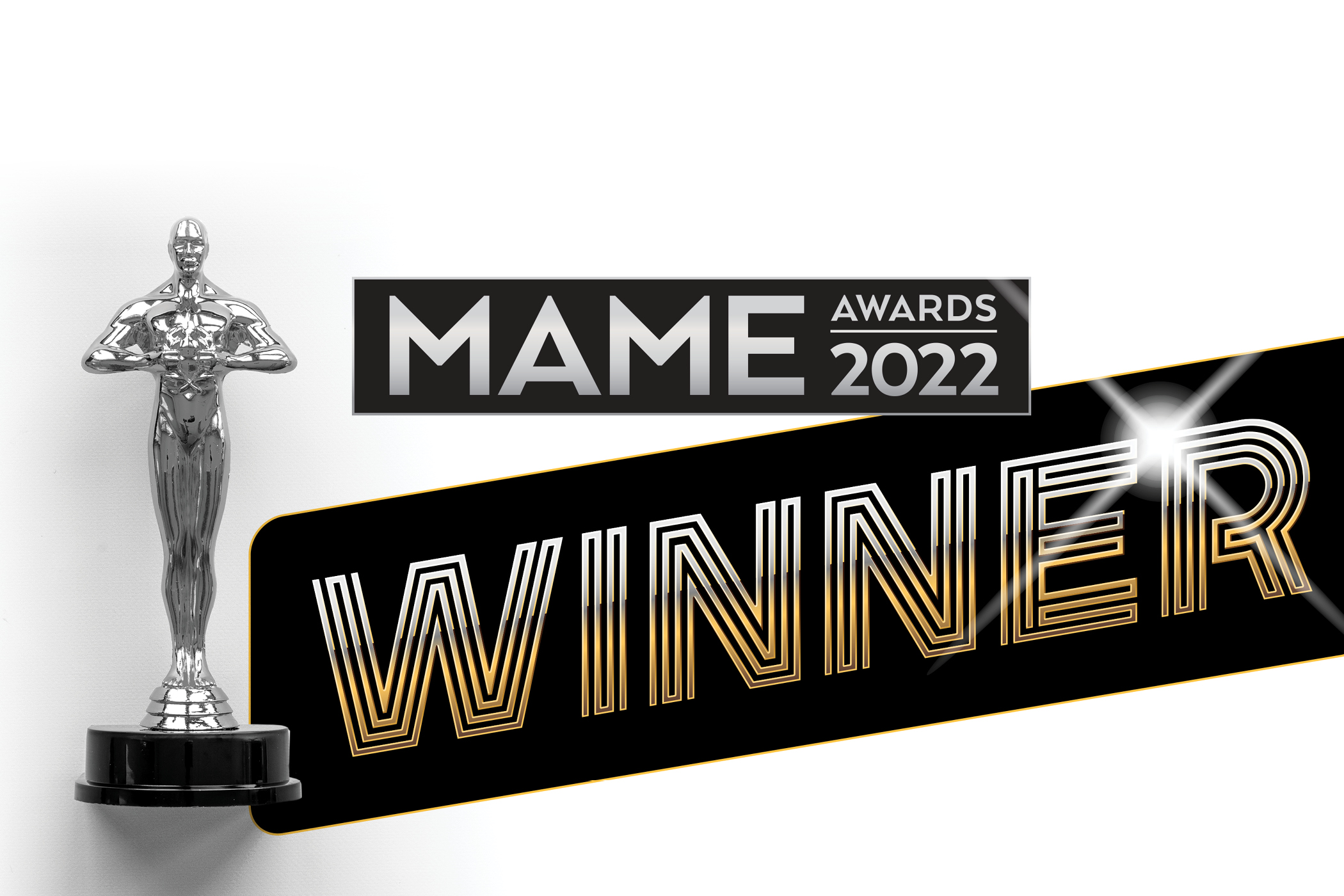
What we won at the 2022 MAME Awards
Best logo design. Best graphic continuity. Best brochure.
We’re fortunate to do what we do, with great people, and for our great clients. It’s our life’s work to get creative. And the fact that we won awards for this stuff at the 2022 MAME Awards makes it that much sweeter.
Taking home awards for best video and best radio at last year’s MAME awards was a treat. That’s why we’re savoring the different award categories we won at the 2022 MAME Awards.
It’s like icing on the cake.
Best Logo Design: Arras Park
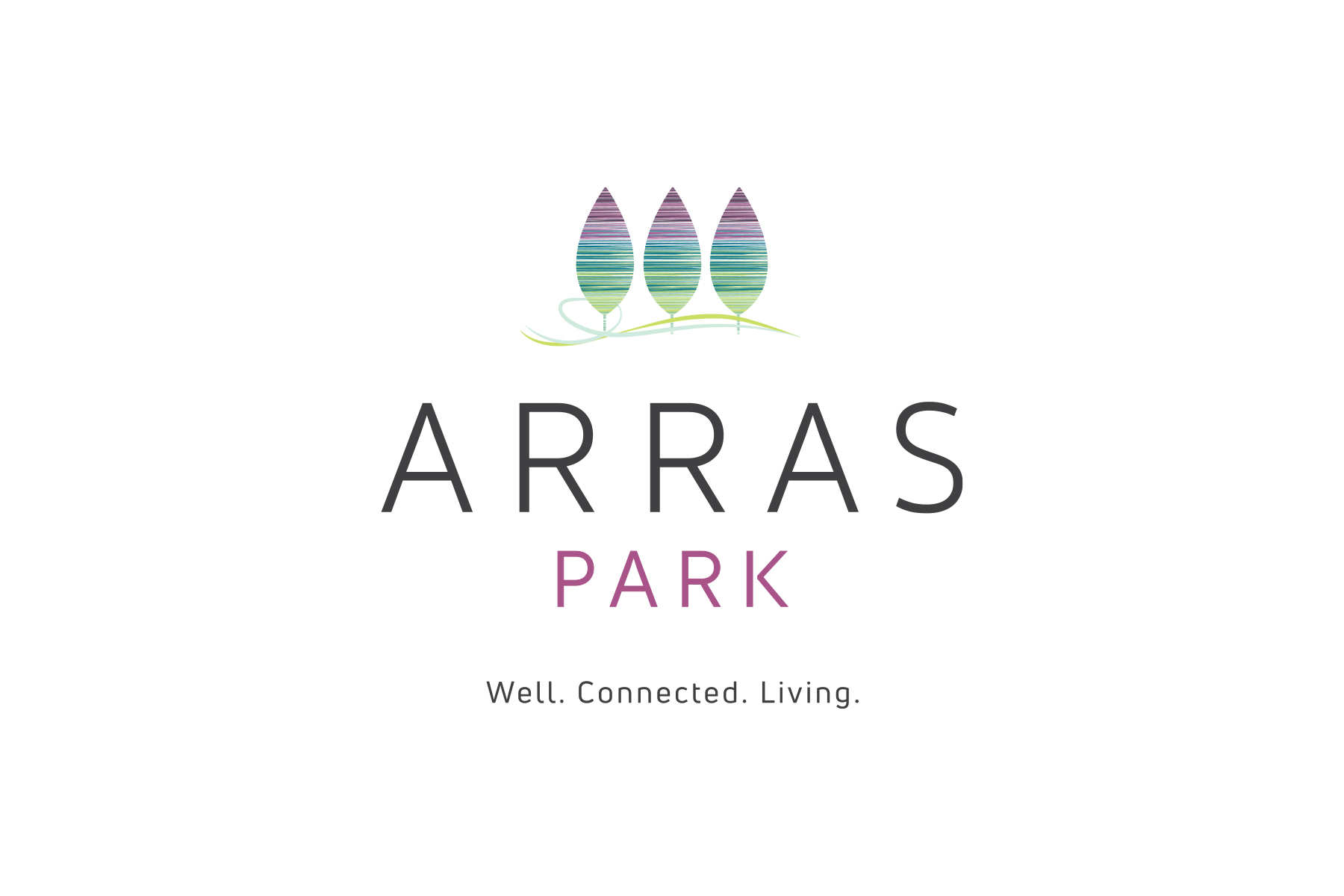
Taking cues from the community’s tethered, woven tapestry of parks, the name of the community – Arras Park – and its identity are connected in nature.
Based on the vision of McStain and land plan of DTJ Design, we crafted a community brand and identity expressive of the innovative new homes that are healthier for their residents and the environment.
The three trees symbolized the multiple park settings and vision of the developer and homebuilder to create greenspaces right outside the door; that feeling of “living in a park.” It is a nod to the original mantra of Denver’s city planning: a city within a park.
Within those three trees is a tether of string symbolizing the definition of Arras – “a rich woven tapestry.” And in full-color formats, the trees carry the brand color palette that visually articulates innovation, nature, and connection.
See more of our work with McStain and the BeWell Center at Arras Park. It’s definitely worth the visit.
Best Graphic Continuity: Sonders Fort Collins
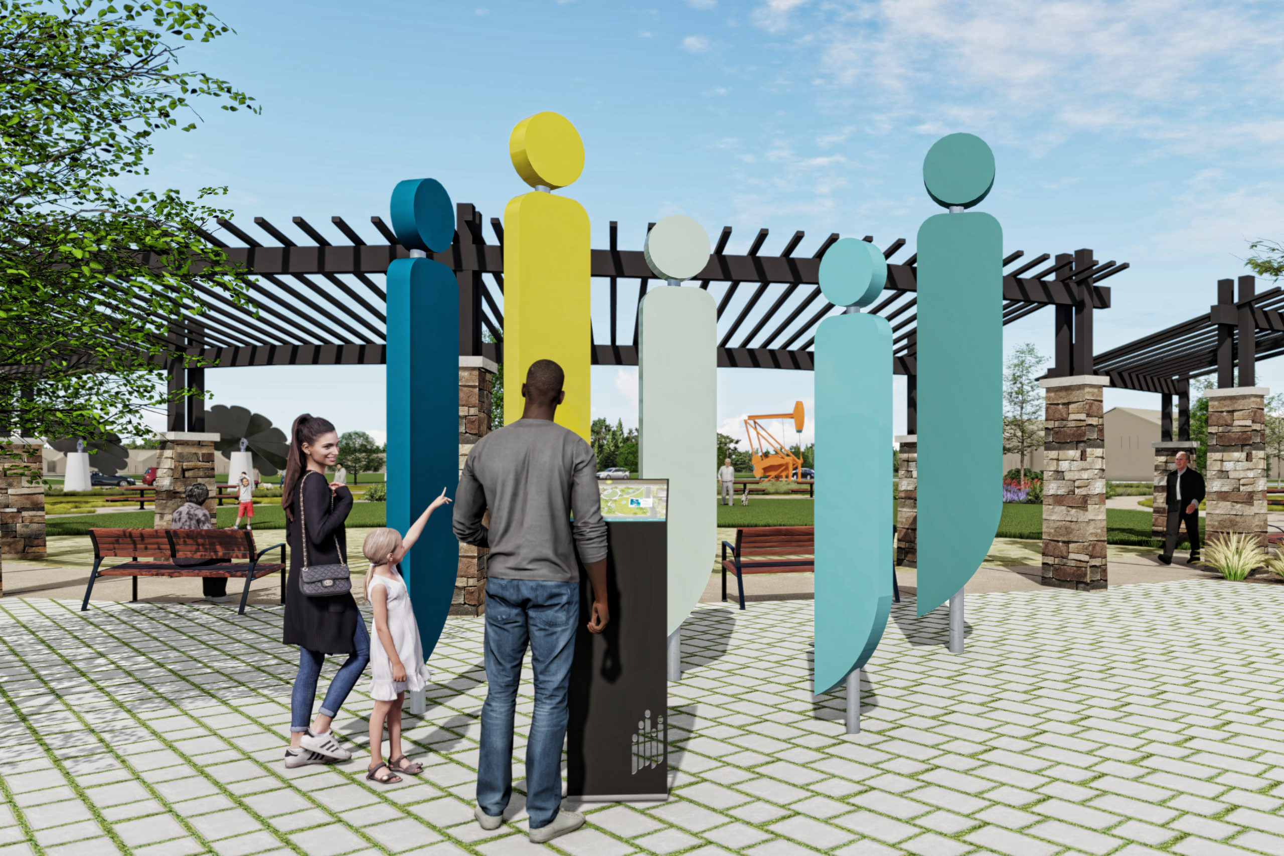
From its identity of human forms in a casual, social engagement, flowing harmonically, to the liveliness of its brochure and the accessible designs of what’s being built, the graphic continuity of the Sonders Fort Collins color palette, playful graphics, and elevated copy are meant to speak to the educated, aspirational, aging buyer type.
Community architecture and signage features that resemble the community brand and articulate the soft and communal nature of gathering spaces and the Sonders Learning Center’s studios. A brochure that showcases a community that’s anything but stuffy and full of everything that engages this audience.
A website that’s experiential and explanatory – giving enough ‘why behind the buy’ for a long-lead, research-heavy prospective home buyer while providing a visually stunning experience.
It’s all to tell the story about feeling good. Feeling good about where our residents live, how they want to live, and who they call their neighbors and friends.
We’re elated to continue working alongside the developer, Actual Communities, LLP, on bringing to the marketplace their signature vision at Sonders Fort Collins.
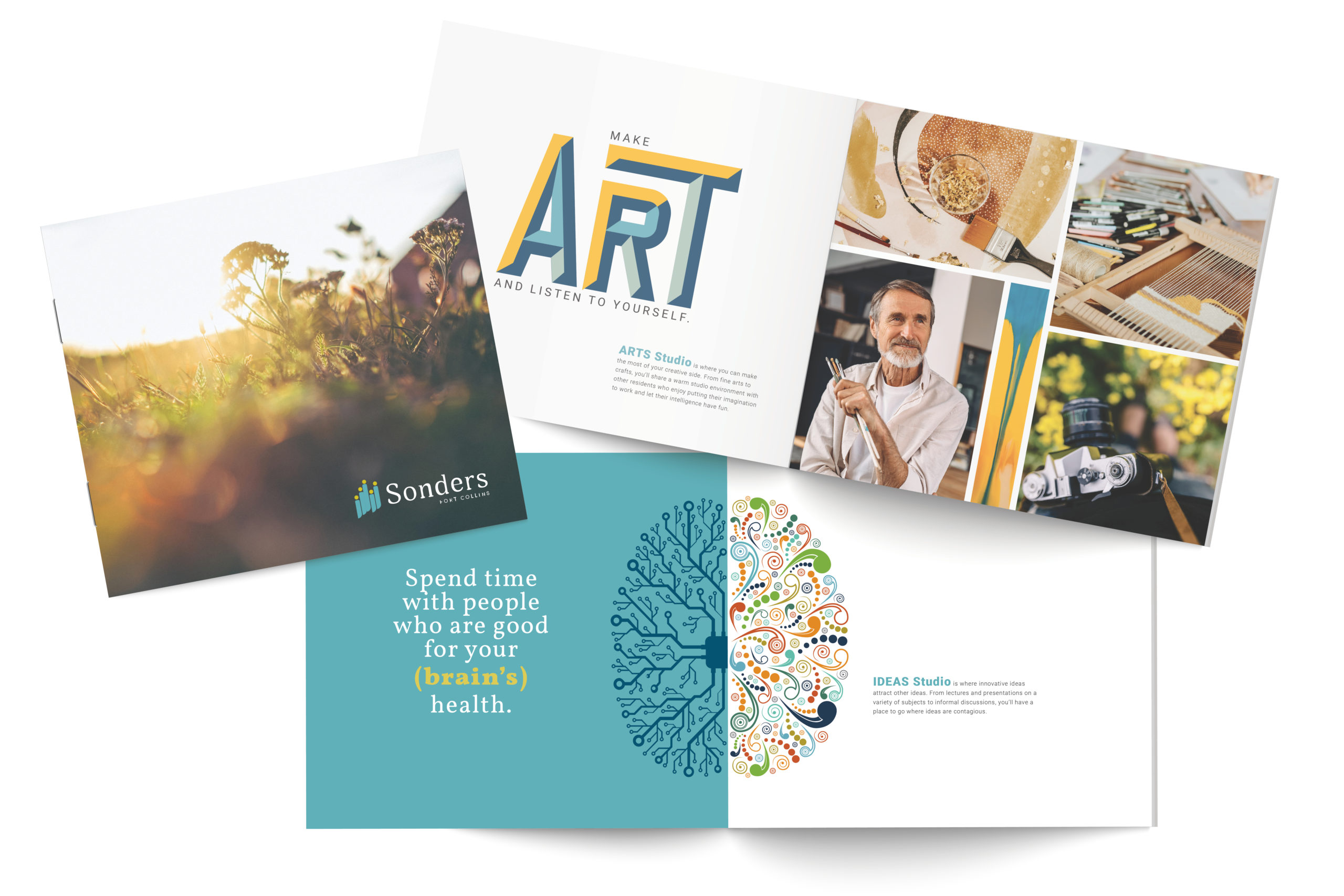
Best Collateral: Sonders Fort Collins
To communicate the community’s philosophy around a healthy culture of aging to our educated, move-down target audience, visuals and visual type helped this philosophy pop off the page.
This is an audience that does its research. ‘Wants’ are oftentimes more of a focus than ‘needs’. Decisions are driven by purpose. And oftentimes, multiple family members are involved.
Thus, a multi-page brochure helps tell the story. It is designed to easily fit with other community or home builder materials, yet stand out amongst the crowd. The brochure is a showcase of how this vision is coming to fruition with energy-efficient, healthy new homes and intentional designs to provide the best experience as our residents age.
Like we said, it’s our life’s work to get creative. And it’s pure fun.
See more of our recent work because we’ve updated a number of our client portfolios.